
Addison Group
Professional services, Recruitment
Role
Creative director
Delivered
Brand expression
Brand guidelines
Website refresh
Addison Group is a Chicago-based professional services firm specializing in talent solutions, executive search and consulting. They needed to refresh their brand to help stand out against a growing competitive set.
The initial strategy uncovered a central truth that became the starting point of all our work together: No one gets talent like Addison Group. This mantra encapsulates the breadth of Addison Group’s offerings, as well as their dedication to the people they serve. Overall, we brought clarity, to their story and to help people find what they need.


Brand personality traits
Welcome
Approachable
Candid
Expressive
Human
When approaching their brand refresh, the only requirement was to keep the original logo intact, which we built a new visual expression system around.
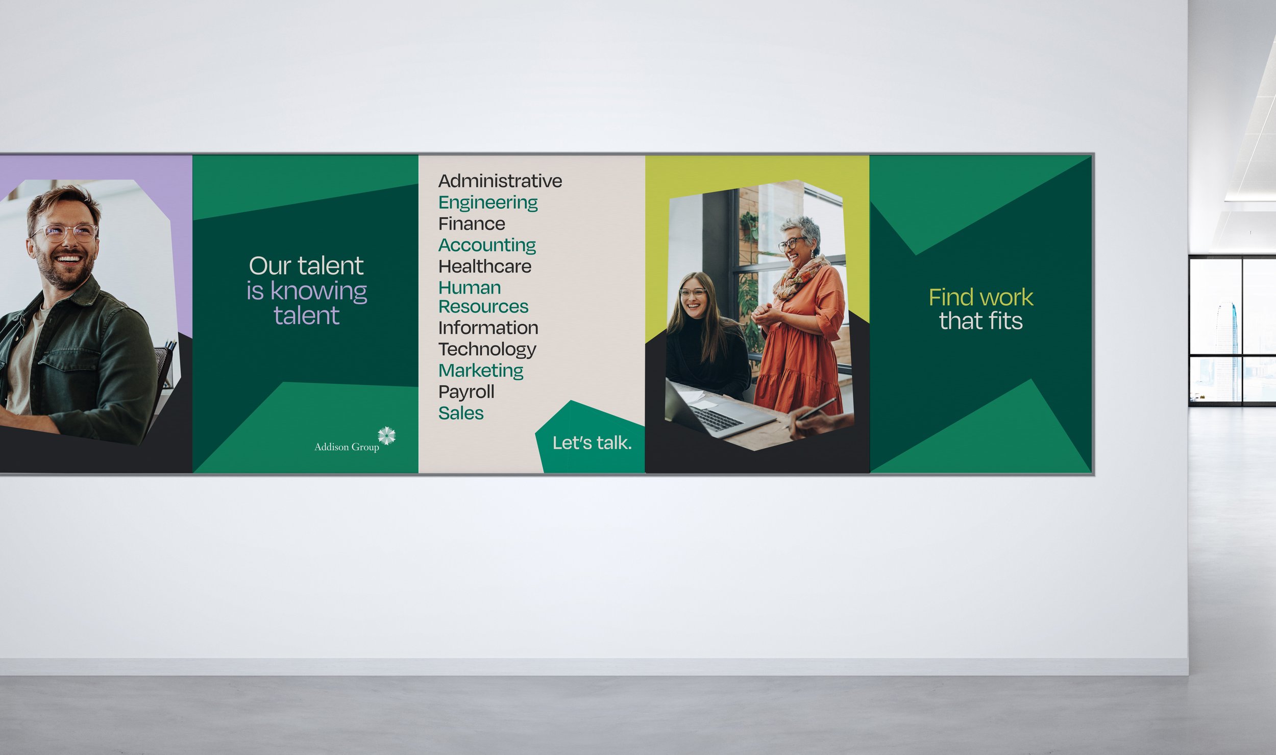
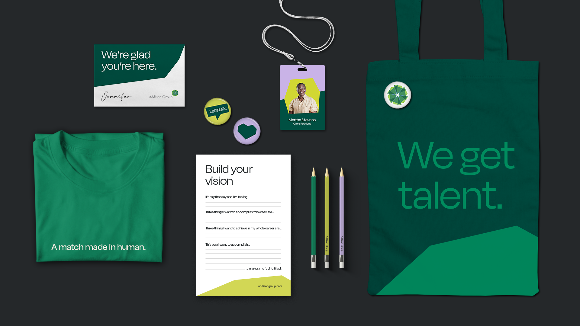
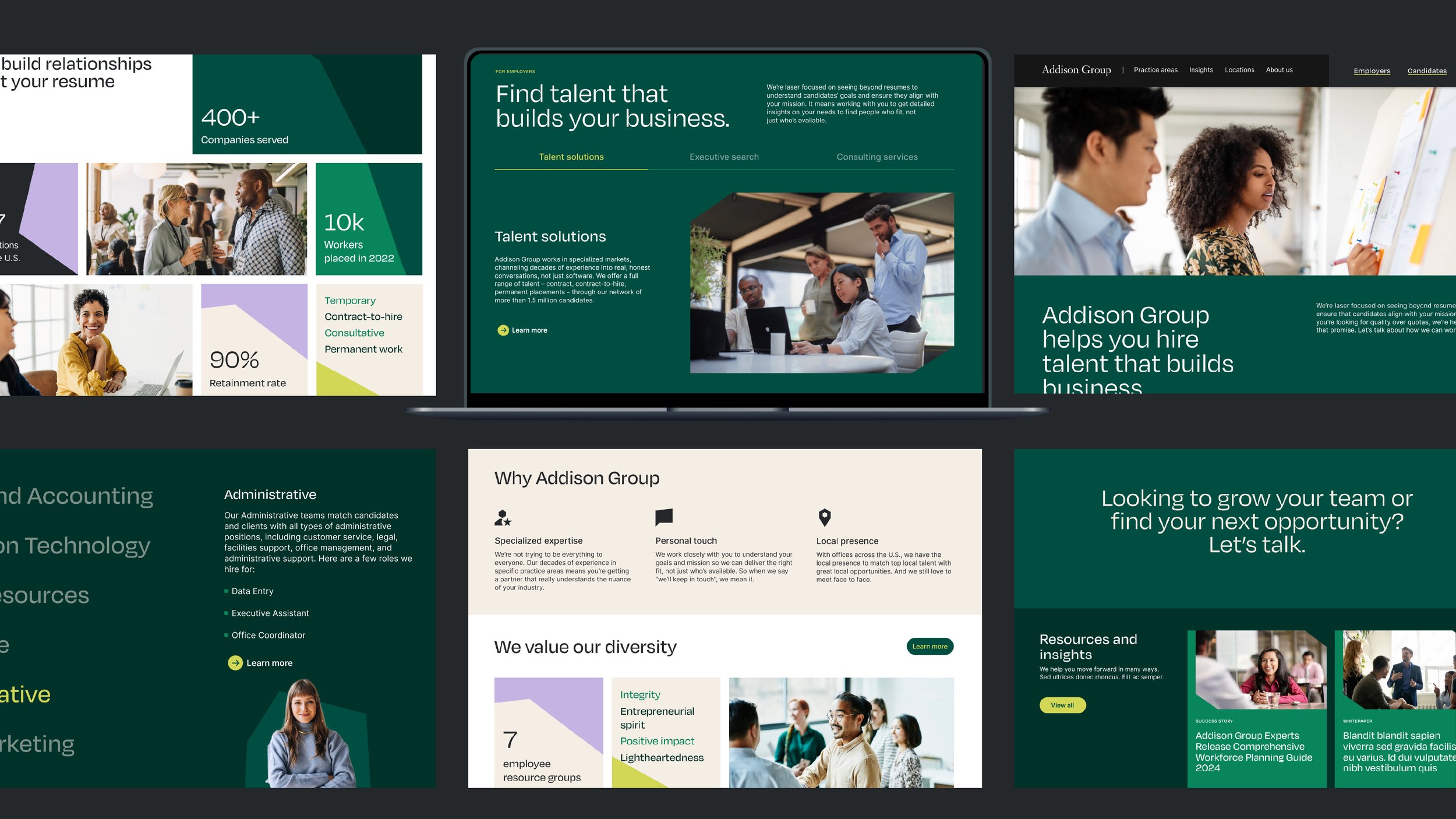
The expression is centered around the hero graphic that we named “gems.” Gems are wide angled shapes that take inspiration from the angularity of the logo, that are meant to feel more human, open, and approachable. We tell our audiences, “You’re gems, unique in your skills and needs. Let’s share those talents with the world.” The unique iconography set shares the same angular cuts and visual weight as the gem shapes.


The updated foundational elements included the color palette, typography, iconography and photography. We added a new display typeface with Degular that has some quirks and personality to it that make it feel approachable and friendly. This is balanced out with the sans serif workhorse font, Inter. For the photography, we chose to center around people, focusing on connecting and fostering relationships. We also wanted to hero people who reflected Addison Group’s values, with cut-out portraits paired with gem shapes.


Website refresh
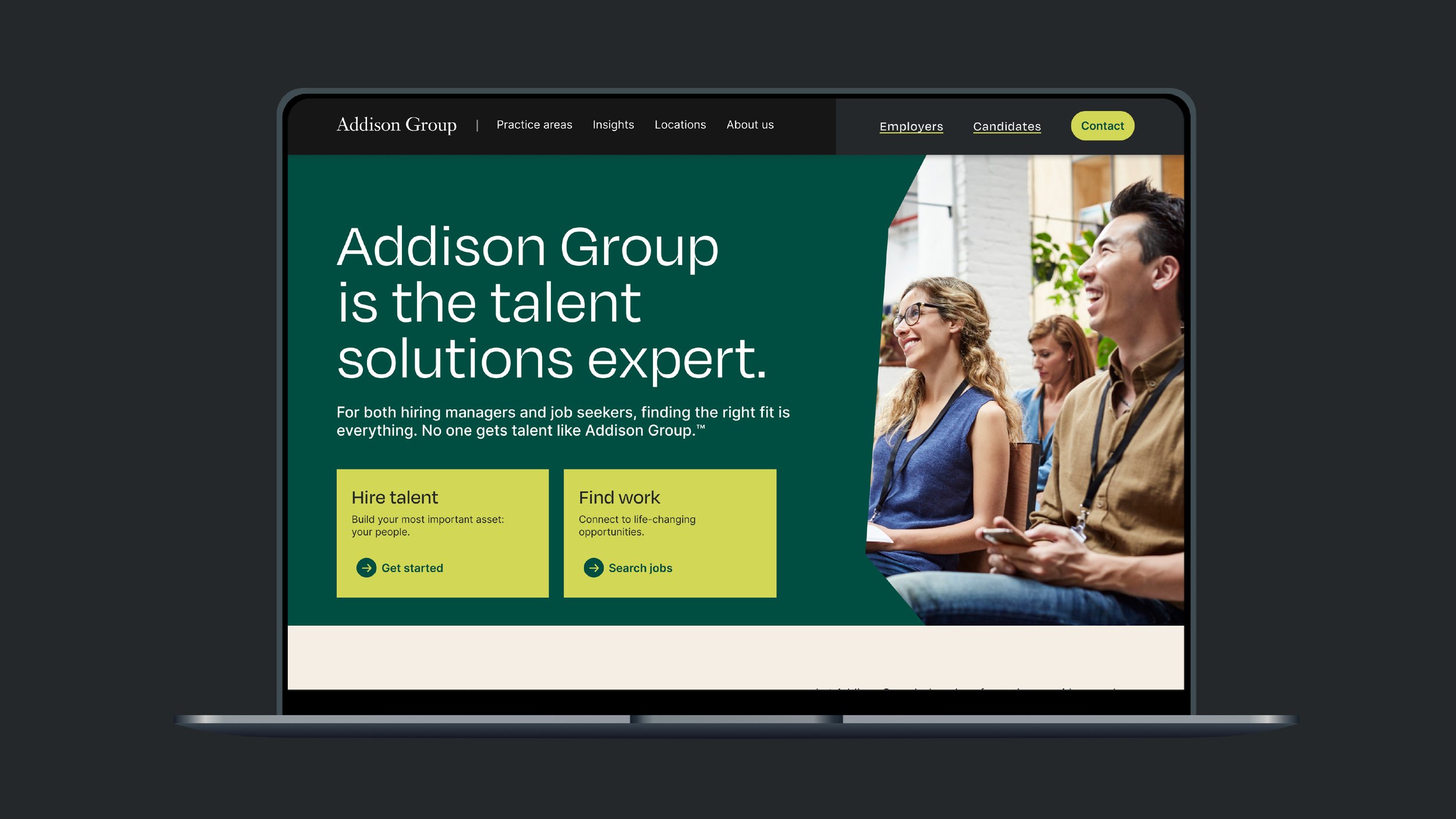
After completing their brand refresh, we were brought on to refresh their website. We kicked this project off by hosting a workshop with the client to define the audiences, journey map and overall goals. One of the largest gaps was that there was no clear journey for their two main users, people looking for jobs and companies looking for talent. When you land on their site now, there is a clearly path for each of the main users.
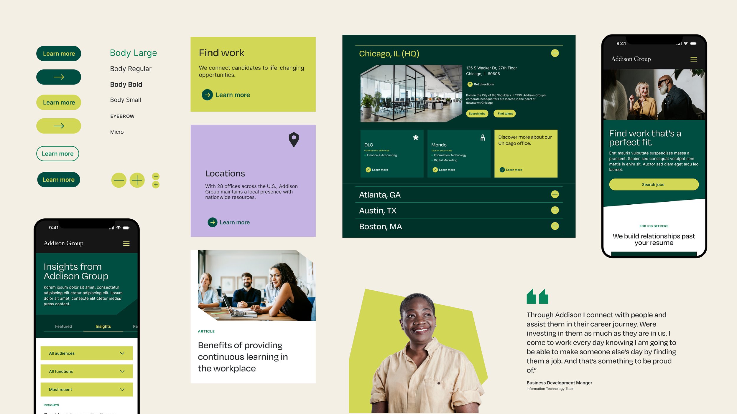
We worked with their internal teams to develop a site map and architecture as well as content mapping and SEO. We developed a design system and page templates for the site following the look and feel of the new brand.
Credits:
Agency: VSA Partners
Executive Creative Director: YanYan Zhang (design), Bill Maday (writing)
Creative Director: Amber Dunk
Designers: Shayna Blinkoff, Michael Ryterband, Abby Williams, Morgan Itterly
Writer: Bisola Sosan, Janelle Blasdel
Strategy: Mike Lee, Rebecca McNerney
